
The Problem:
Our current website and overall paid subscription service have not been looked at in a few years, and after looking at our analytics, we could be receiving much more engagement. That being said, we will be looking into redesigning aspects of the website – we will determine what will be redesigned after performing user research.
Overview:
I had begun my role at PRWeek in 2016. Upon my arrival I had begun immersing myself into the business. PRWeek is a paid subscription service (a gated website and print magazine) which delivers the most recent news to its subscribers through e-mail and its website PRWeek.com. Public Relations and Communication Individuals use PRWeek as a news source but at the moment we are not getting the most optimal engagement.
My Role:
UX Designer
Scope of Work:
Redesign different pages of our website
Tools:
Sketch, Survey Monkey, Pen and Paper, CrazyEgg, Google Analytics, HotJar
Research Methods:
Heuristic Evaluation
Competitive Analysis


My Approach:
Perform a Heuristic Evaluation
Create and Evaluate Results from a User Survey
Present my Findings to the Team
Present Redesigns to our Team
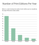
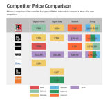
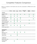
Competitive Analysis Conclusions:
- Considering its current rates, the frequency with which it produces a print edition, and the features that come with a subscription, PRWeek should consider either a) reducing its subscription cost or b) adding features to its current offerings.
- Features to consider adding are discounts and/or access to events, whether in person or virtual, and resources for younger job seekers and those looking to further their career in PR/marketing/comms.
- PRWeek could also consider advertising “exclusive content” or “in-depth analysis” among its subscription features.
Value Proposition and Research
The goal of this project was to understand how our users use PRWeek, what their thought process while interacting with the site, and what they expect out of a paid subscription service. This study was meant to understand what drives them to our website and figure out how we can add value to our subscription in order to increase our revenue.
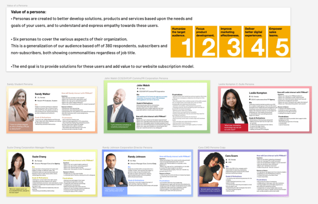
Personas
I had created a survey through Survey Monkey, asking users a series of questions in regards to user demographics, how users feel about our product, what competitor sites they view and what their motivations are. I have spoken with stakeholders and have reviewed data through our sign-up form on our website that we have collected over the course of 10 years, asking for user information such as age, job title, and industry.
User Feedback
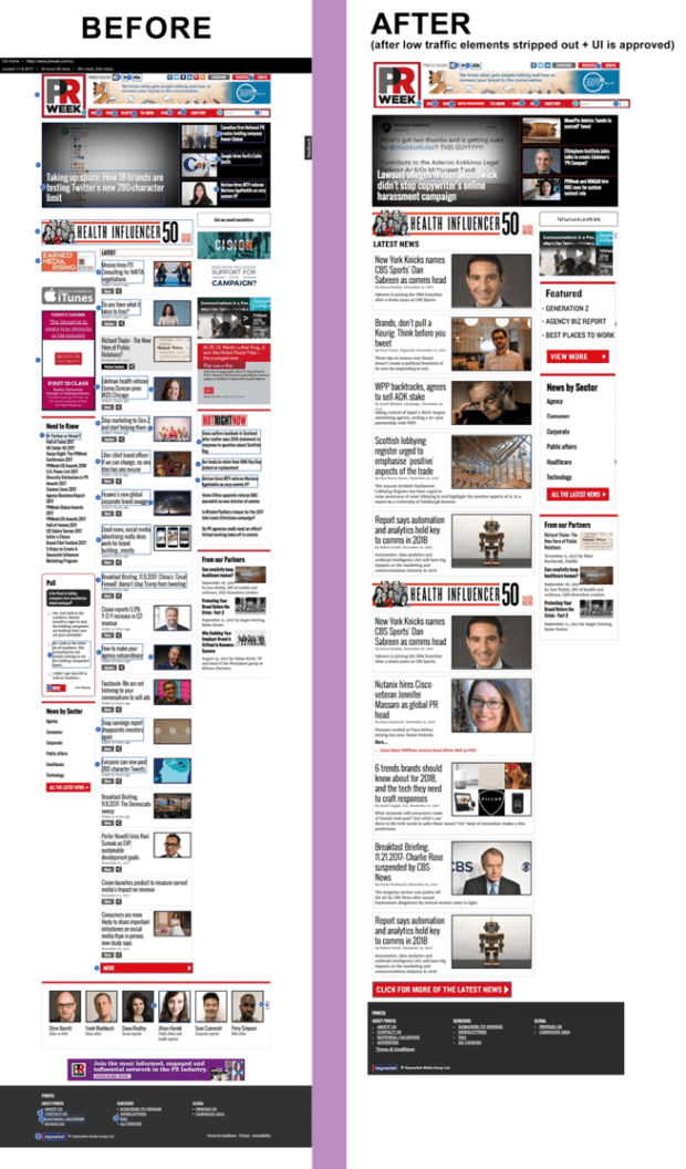
After sending out a user survey and reviewing 500 survey results, I have observed a few trends. It was apparent that our users thought our homepage was cluttered, making it difficult for them to navigate through our website. I had taken this into consideration and have recreated our homepage with this feedback.
Goal + Methodology:
Goal: To successfully have the user feel comfortable on our homepage, which in turn will have an increase of the time on our website.
Methodology: The usability test consisted of setting up live video recordings through HotJar in order to see if our users would successfully engage with our new homepage design. We had also implemented a HotJar widget asking for user feedback on our new homepage.
Key Learnings: Our survey results had not only concluded that our website was too cluttered, but had also uncovered that many of our site visitors felt as though our subscription price was too high. We are running a separate project in order to dig deeper into that which include semi-structured phone interviews, but in regards to our homepage redesign efforts our Google Analytics had reflected increased engagement numbers from our website visitors.
